Overview
ReCommunity
A Hands-On Approach to Brand Development
When ReCommunity approached Atomic Wash, they were in crisis mode, literally just a week away from their public launch, and they still didn’t have a logo. As Creative Director, I thrive in high-pressure situations, where creative problem-solving must happen fast without compromising quality. With ReCommunity’s mission, vision, and values as my guide, I took a hands-on approach, working closely with our designers to develop a brand identity that truly represented their commitment to community partnerships and sustainability.
Building the Brand from the Ground Up
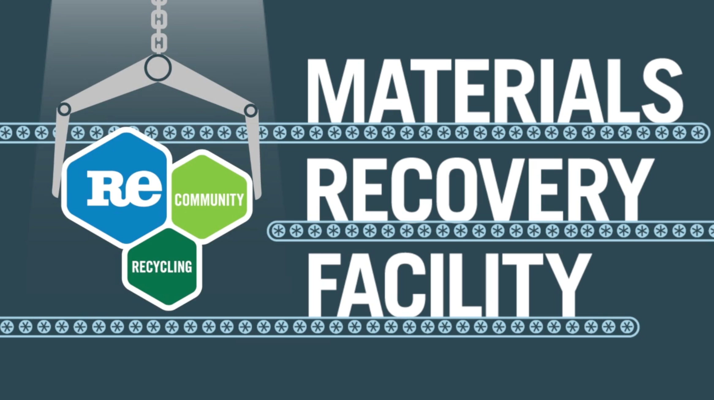
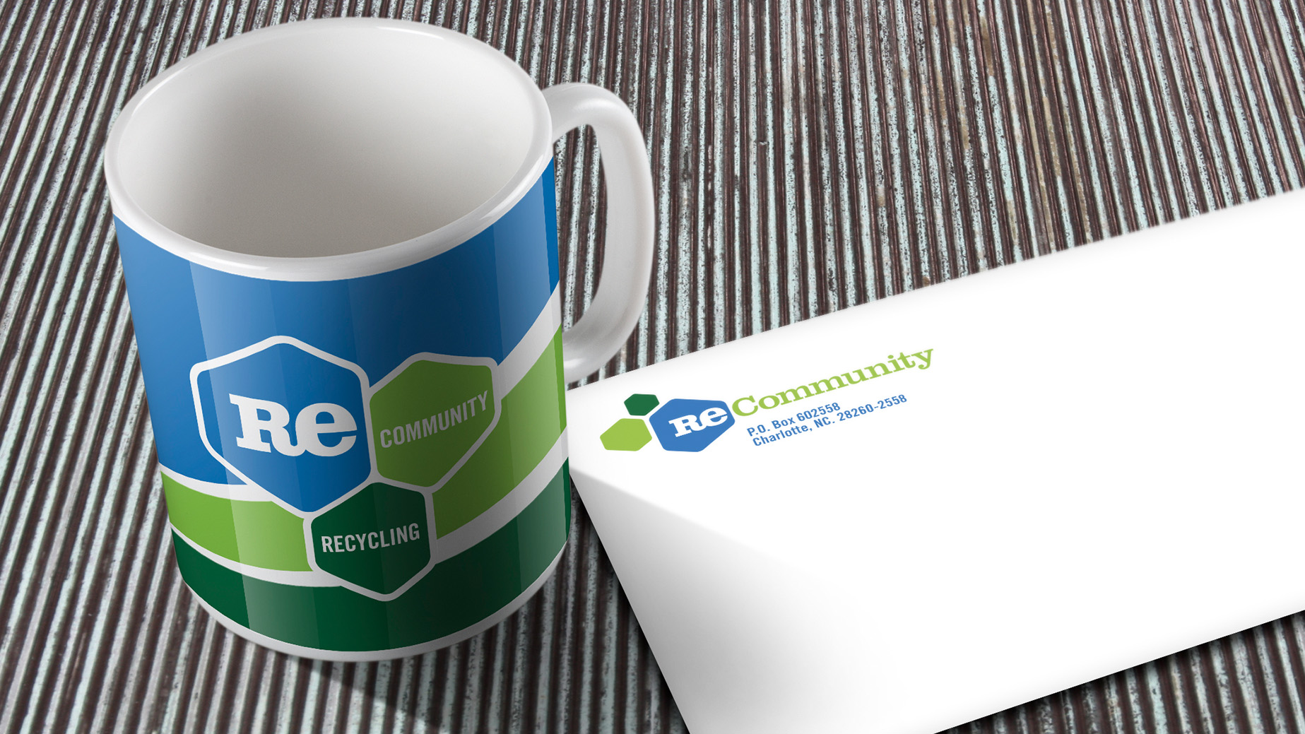
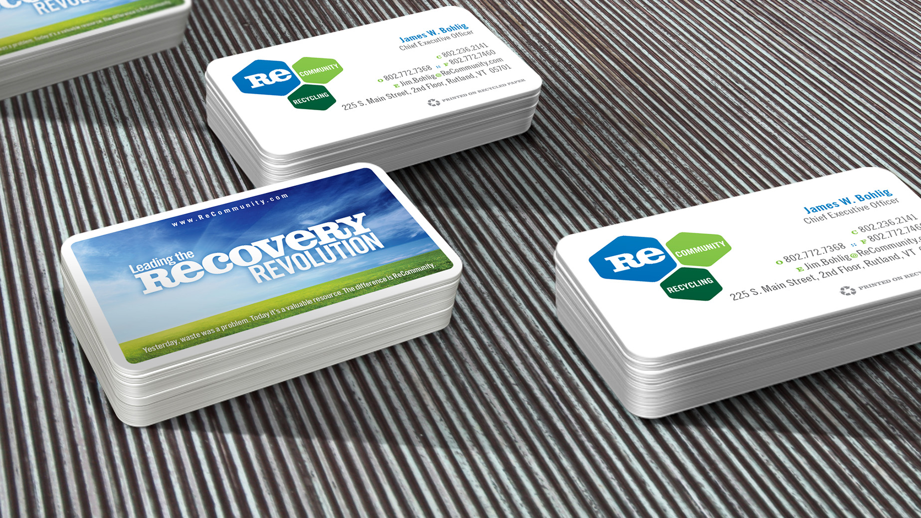
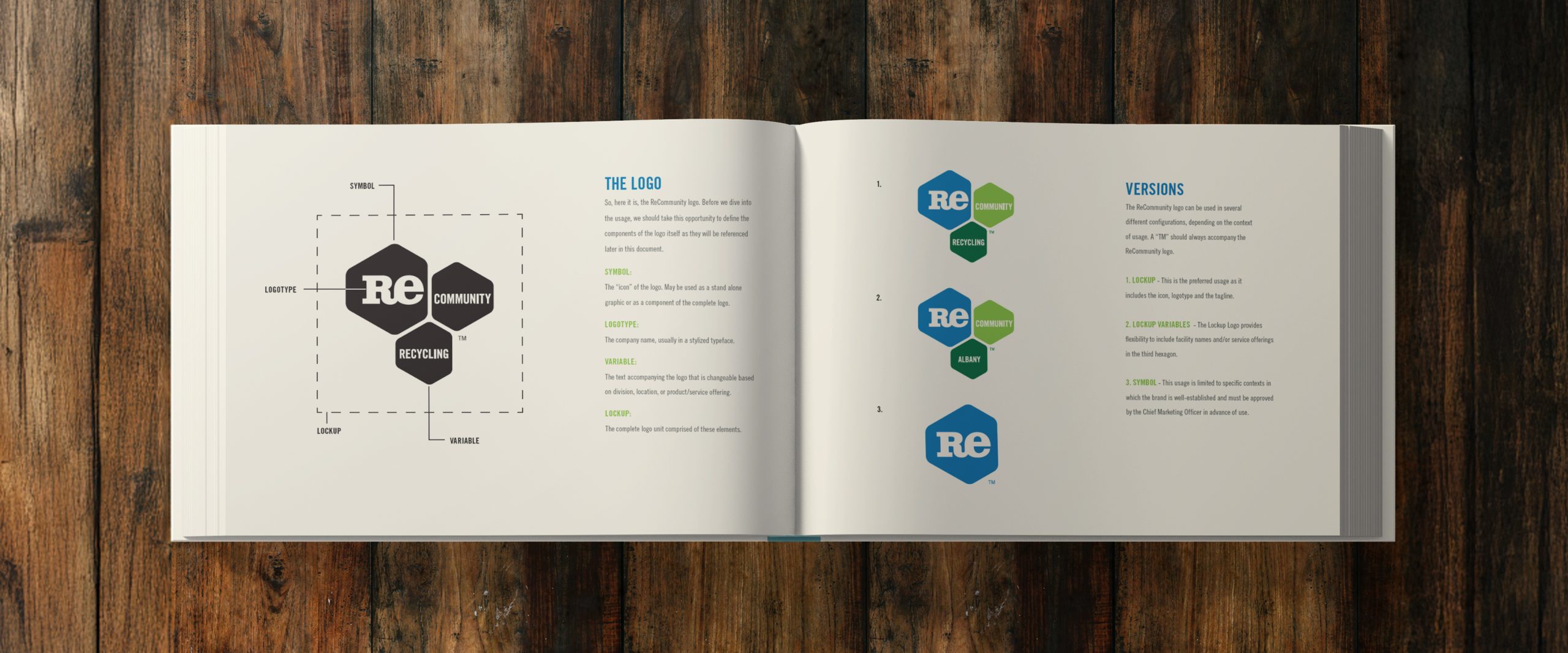
I led the charge in crafting a logo that encapsulated ReCommunity’s mission. The design centered around three interlocking hexagons, each representing a carbon molecule. The first, “RE,” symbolized the company’s ability to breathe new life into resources that would otherwise end up in landfills. The second, “Community,” underscored their dedication to strengthening local communities nationwide. The third was designed to be adaptive. Originally labeled “Recycling,” but built with the flexibility to incorporate individual community names as they joined the movement. This scalable logo system became an iconic stamp of recycling awareness, helping cities nationwide integrate the ReCommunity brand into their sustainability initiatives.
Crafting a Powerful Brand Message
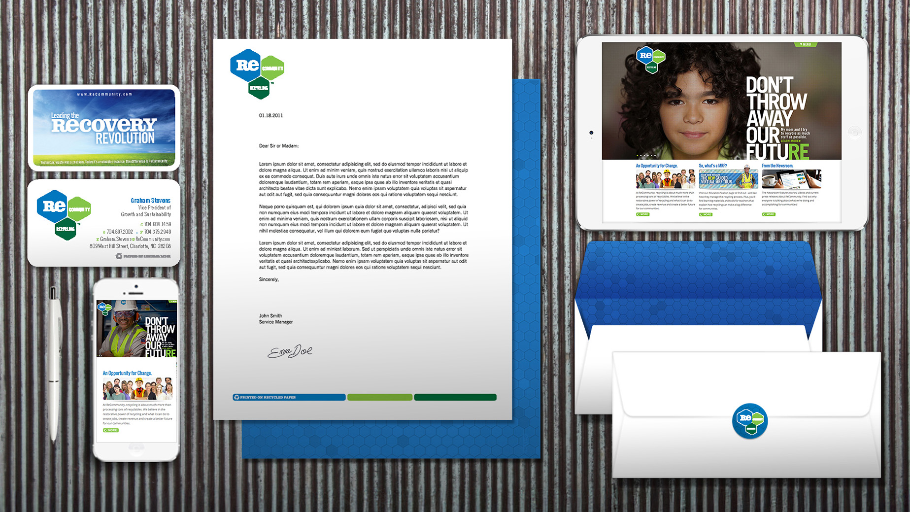
A brand is more than just a logo, it’s the story it tells. I co-developed the concept behind “Don’t Throw Away Our Future,” with master copywriter John Reed, and my partner Jamie Kasman. It was a messaging strategy built around a simple but powerful act: the fraction of a second it takes to decide whether to toss something in the trash or the recycling bin. That tiny decision sets in motion a massive movement—one that recycles valuable resources, creates jobs, and reinvests in local communities through ReCommunity’s profit-sharing programs on recycled materials. This became the basis for the ReCommunity Manifesto, a touchstone document that informed everything we created from that point forward.
This message became the foundation of ReCommunity’s entire brand voice, resonating across their marketing materials, website, and community engagement initiatives. Instead of relying on technical jargon about the recycling industry, we focused on making sustainability personal and action-driven. The idea was simple: empower people to see recycling as an act that preserves the future for themselves and generations to come.
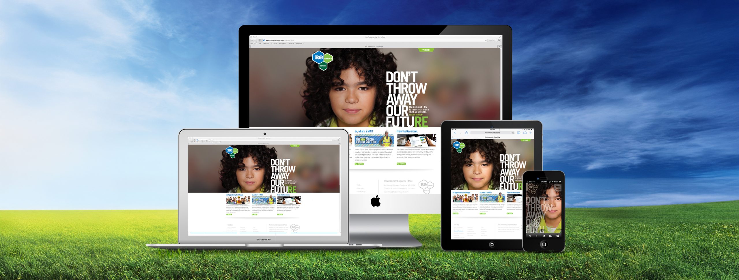
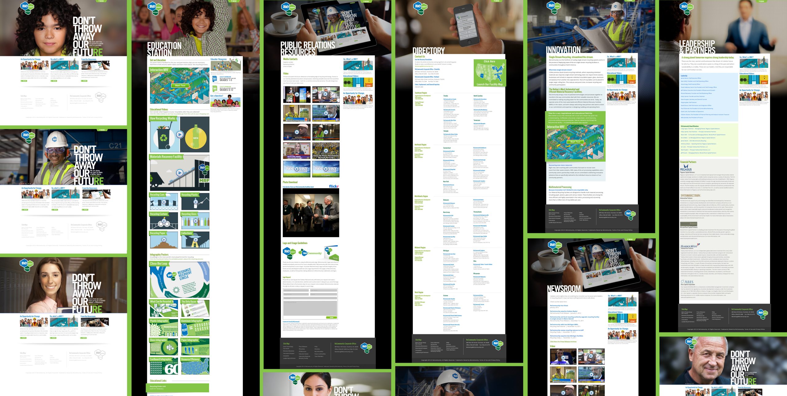
Developing a Website That Speaks to the People
ReCommunity needed a digital presence that set them apart from competitors while staying true to their new brand identity. More than just a corporate site, I wanted their website to tell a story—one that resonated with individuals and encouraged them to take action.
I led the development of the “Don’t Throw Away Our Future” campaign, which became the foundation of both the website’s design and ReCommunity’s brand voice. The site wasn’t just about listing services; it was about inspiring real change. We structured the user experience around the idea that every person has the power to make a difference. Instead of a sterile, corporate-style site, we created an engaging, consumer-focused platform designed to drive home the importance of recycling.
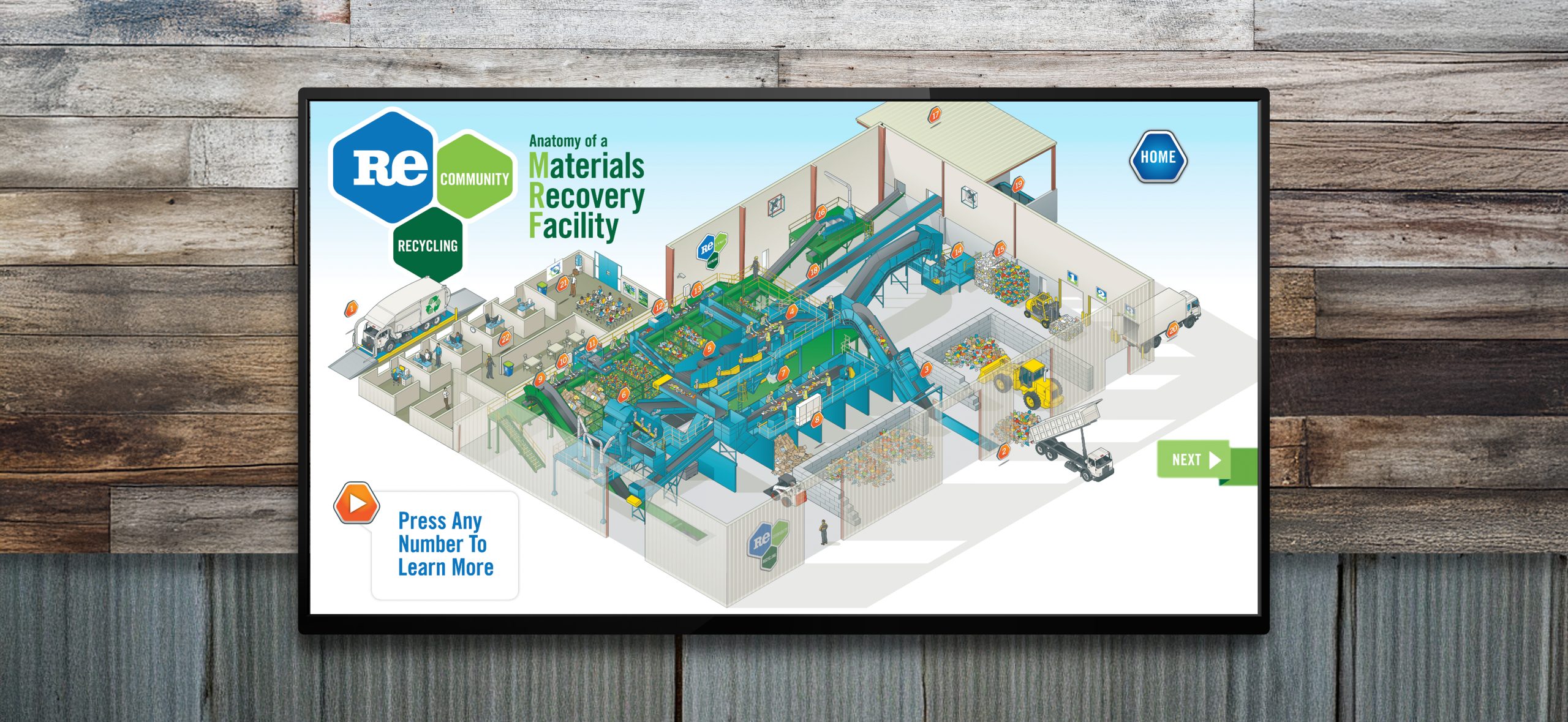
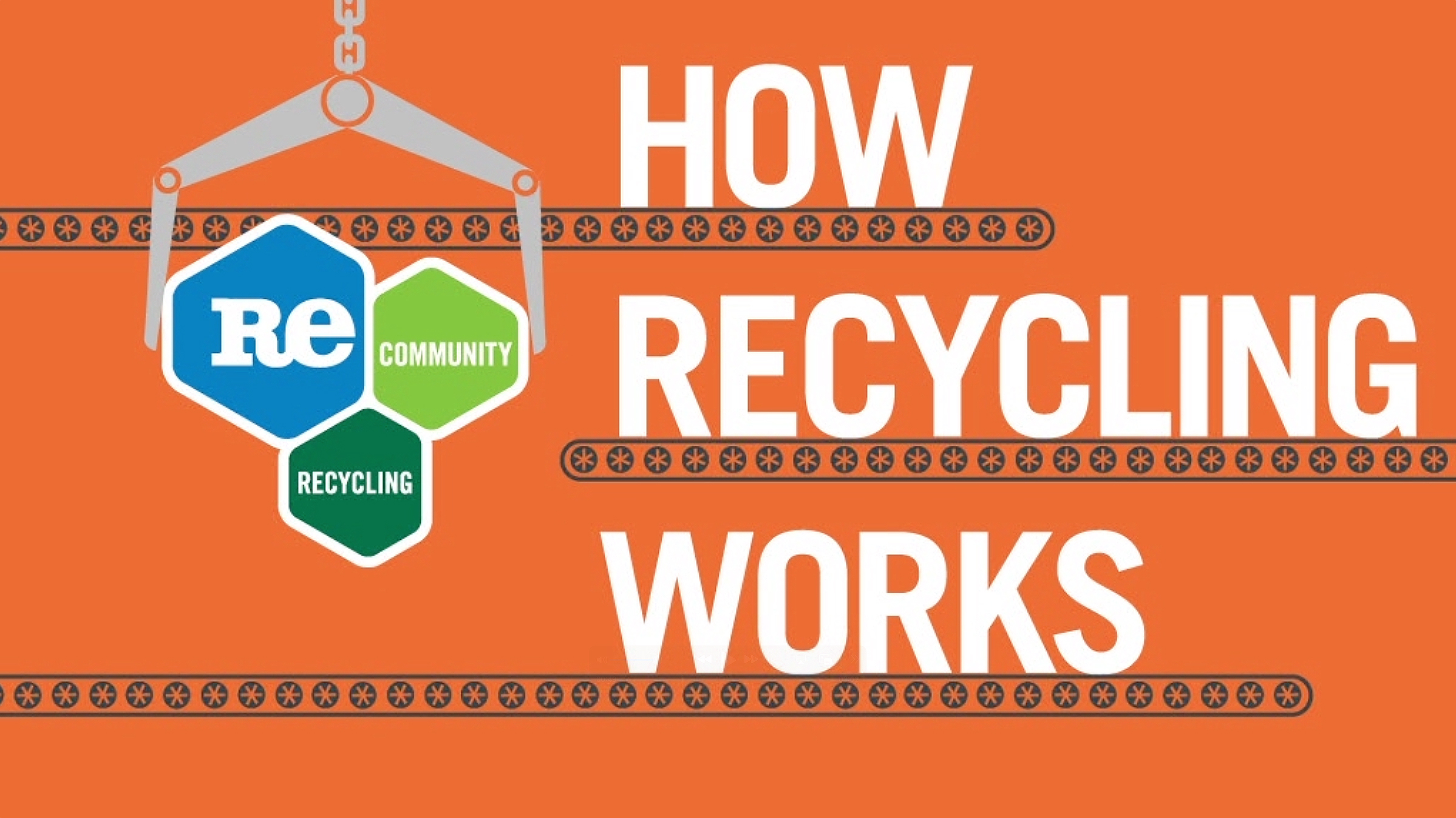
Interactive Materials Recovery Facility (MRF)
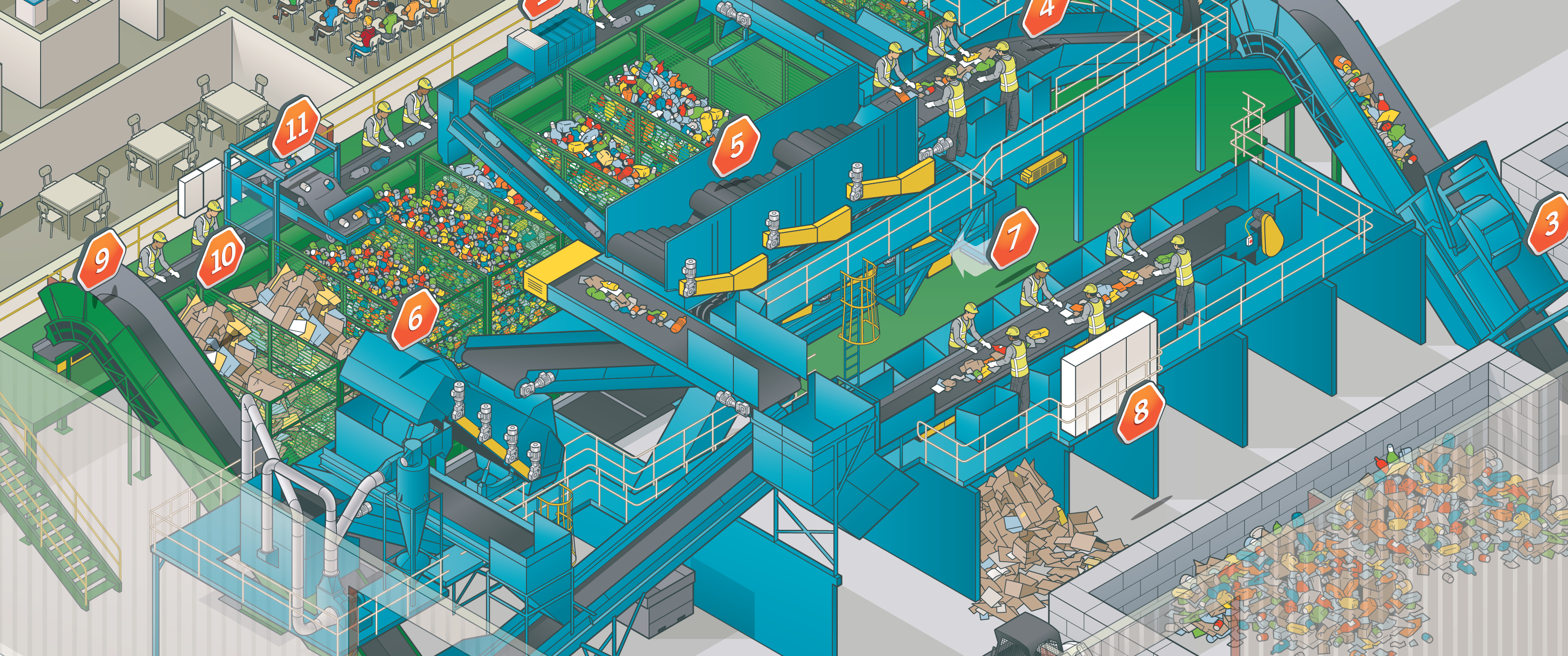
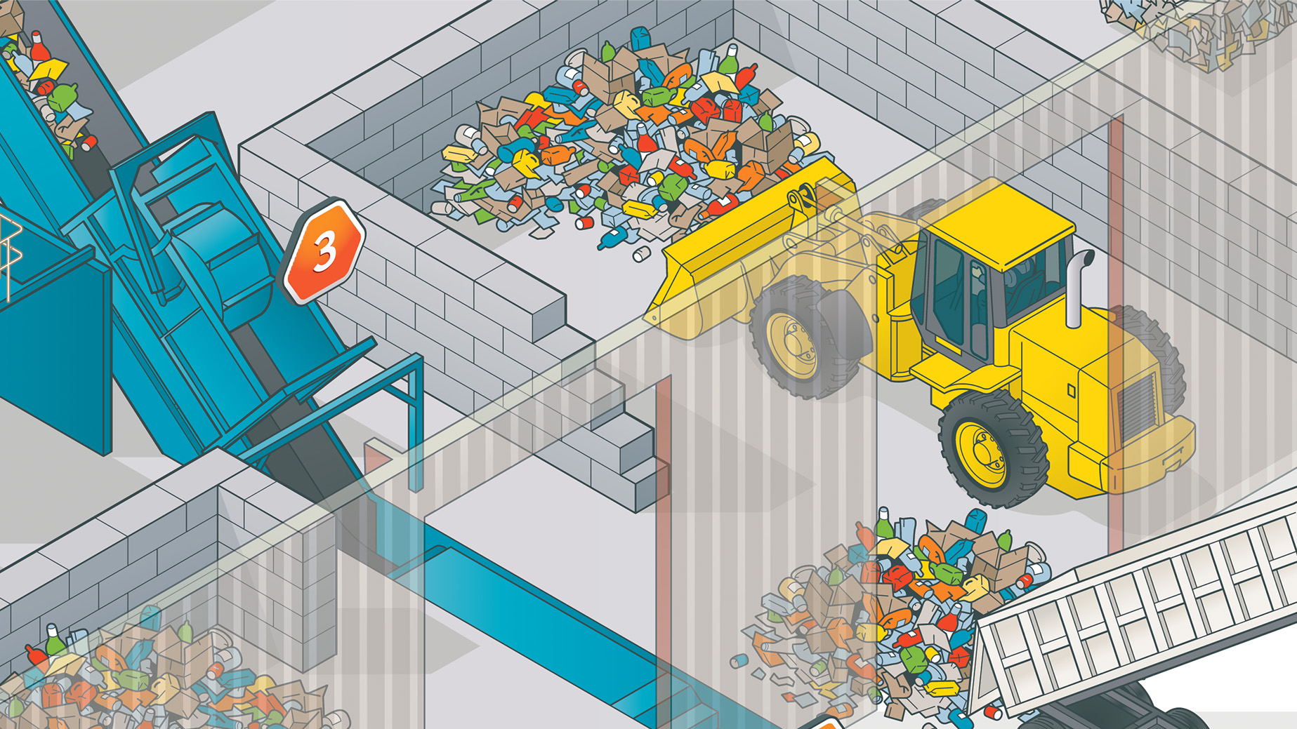
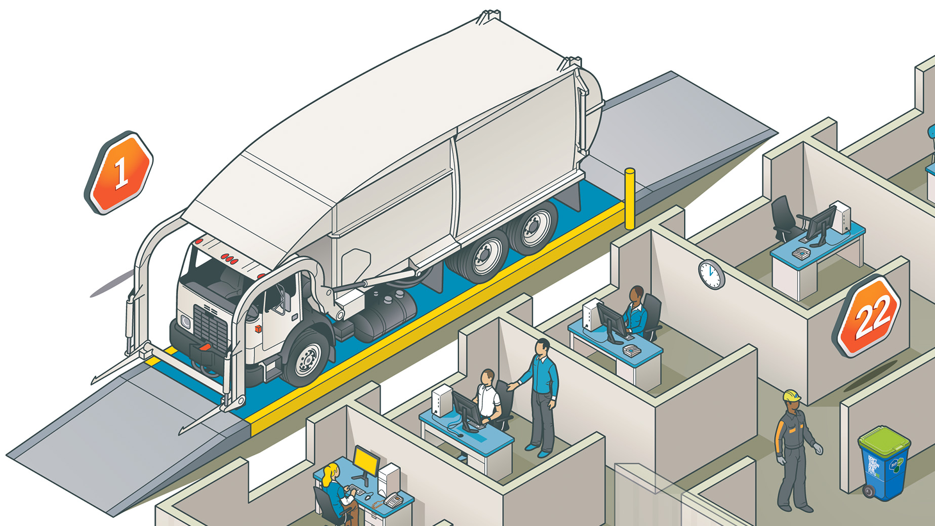
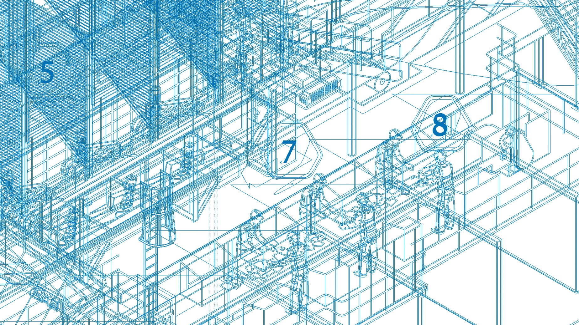
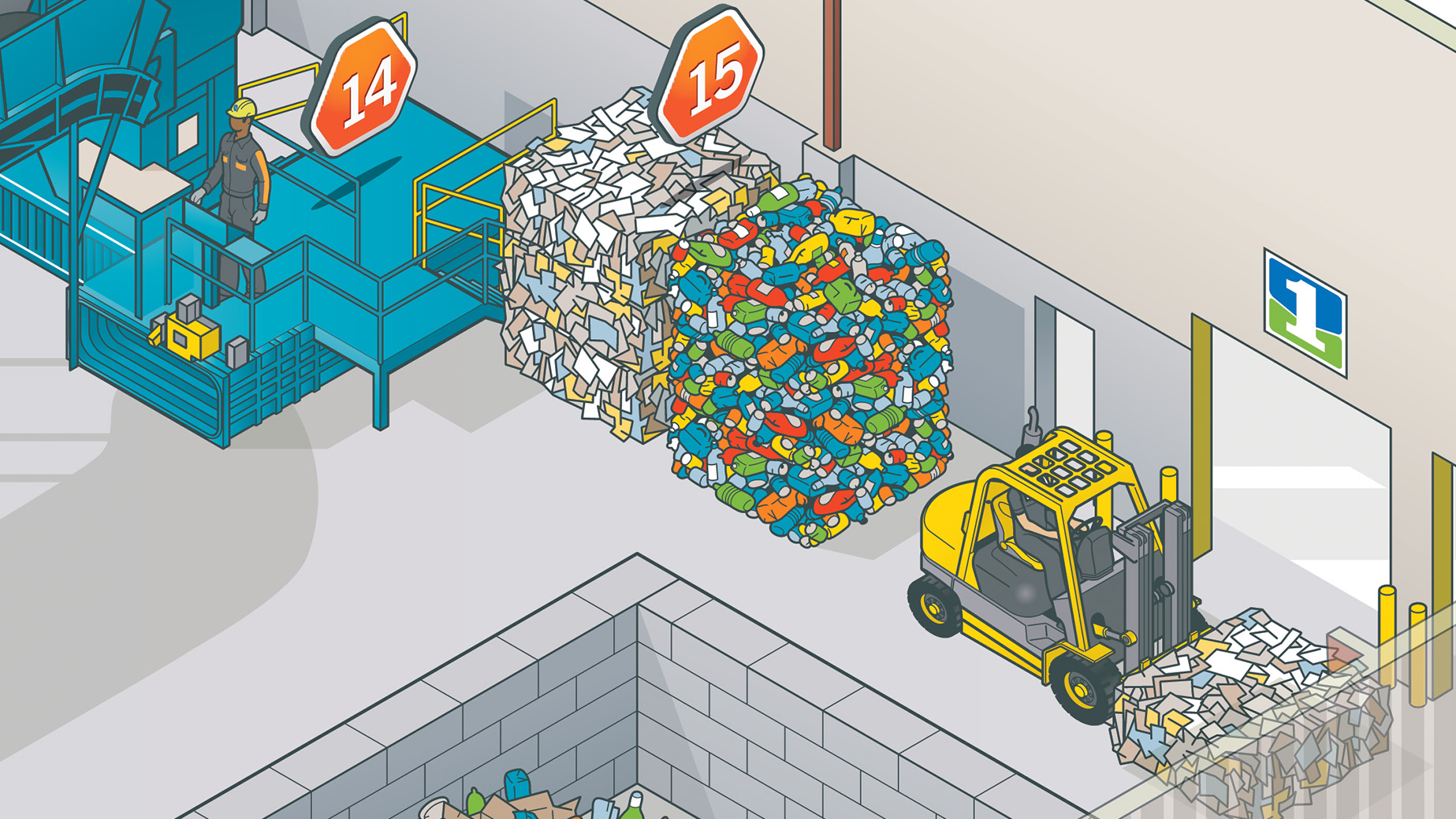
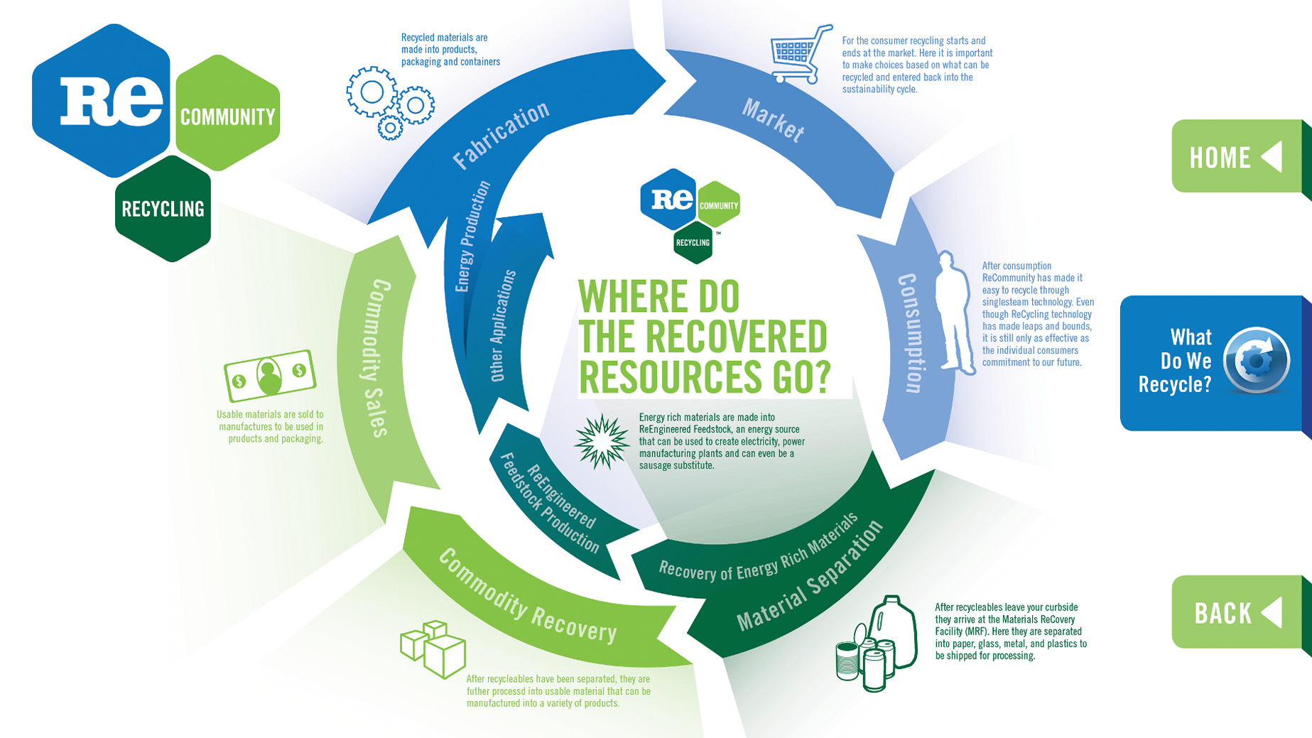
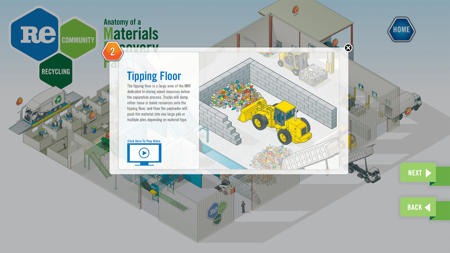
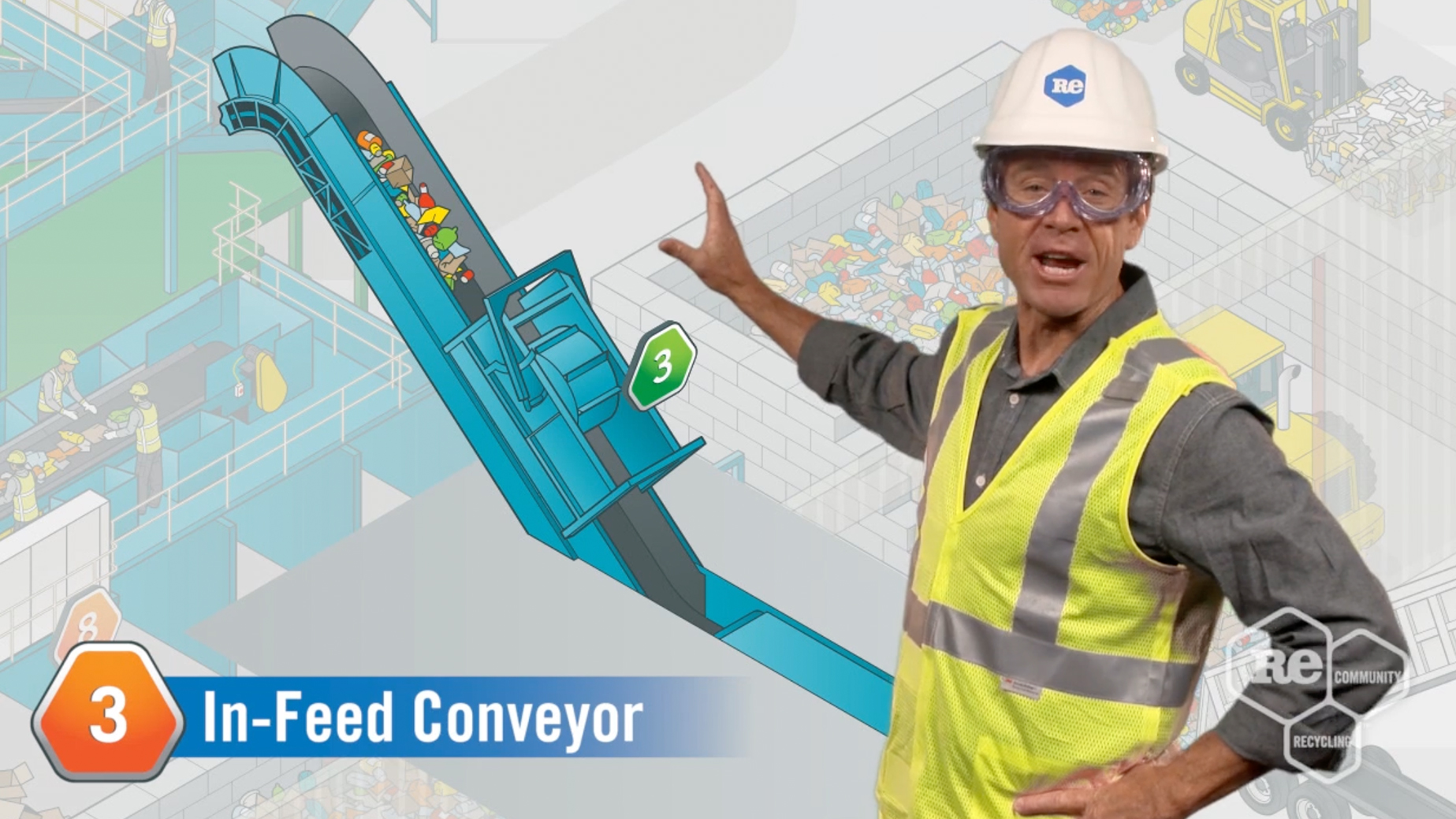
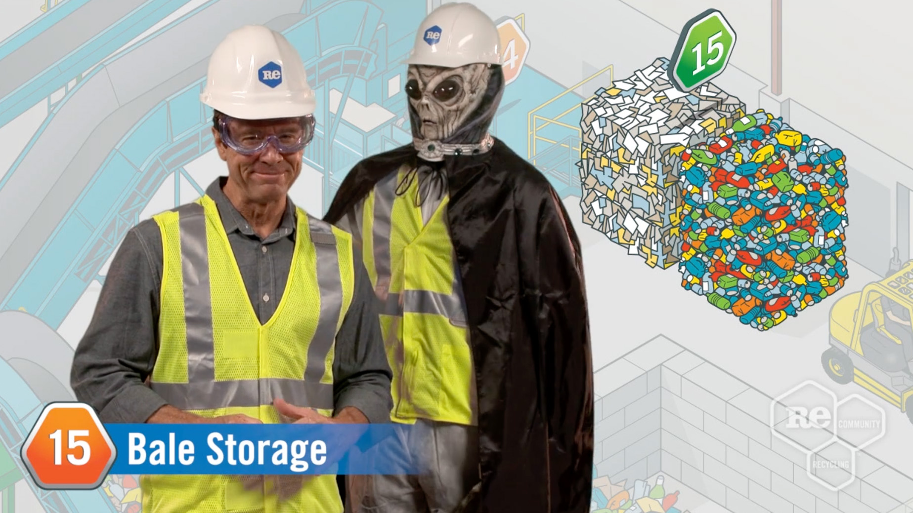
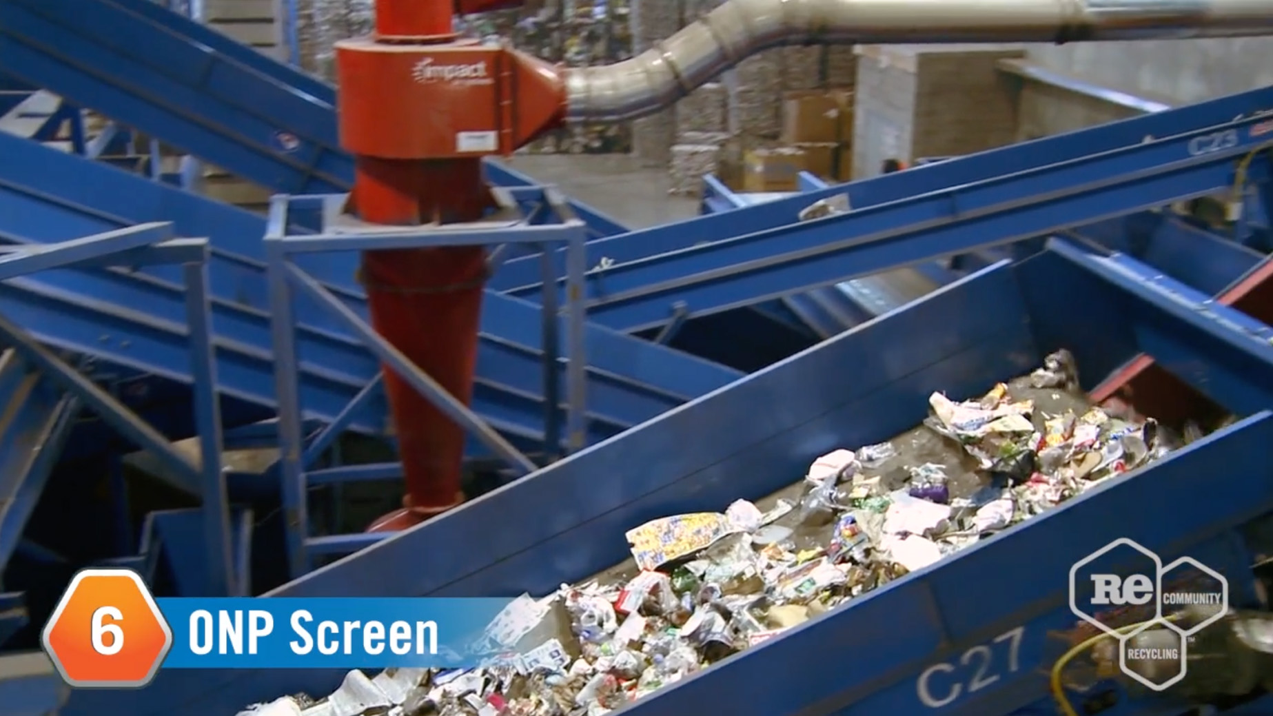
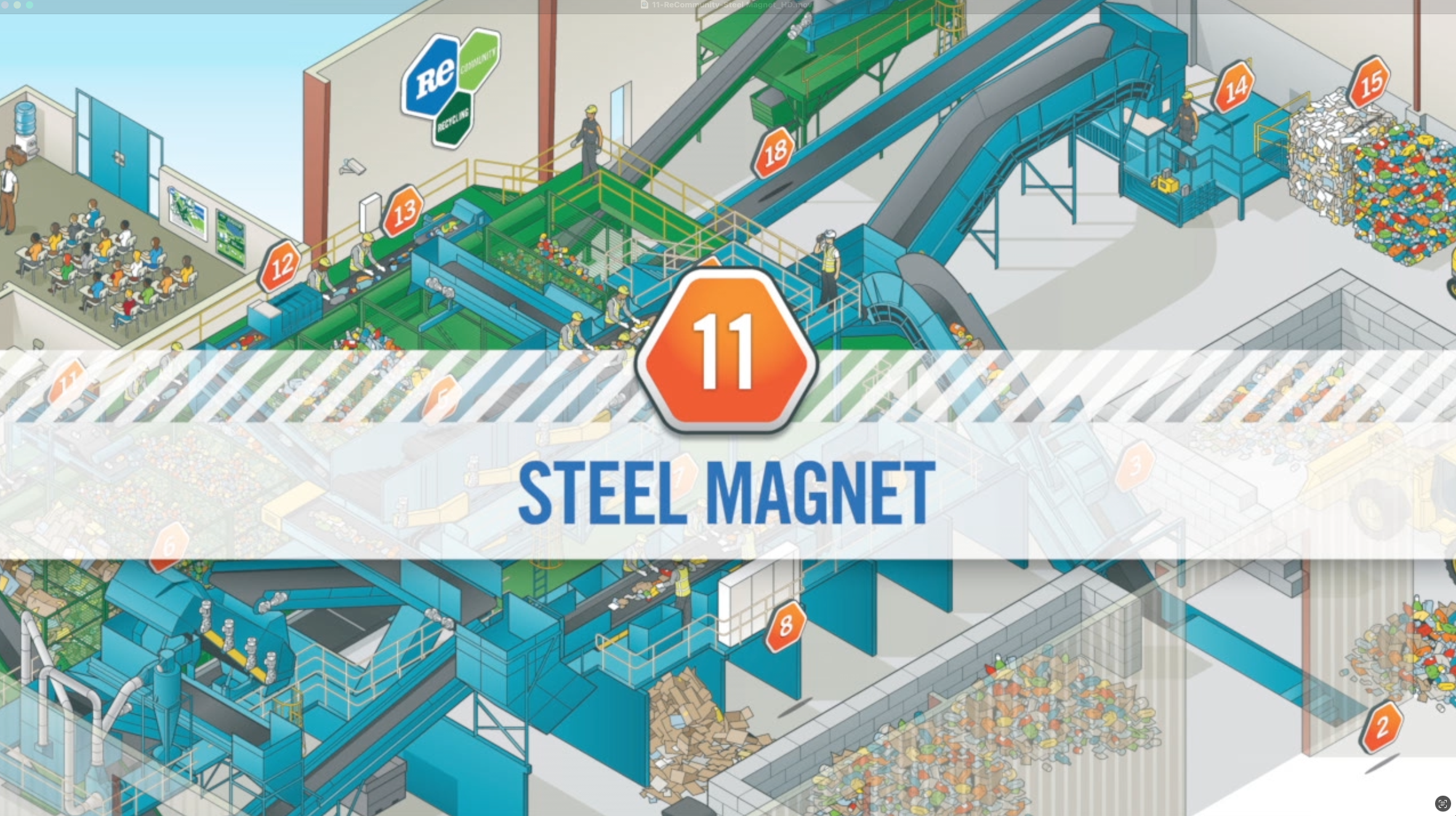
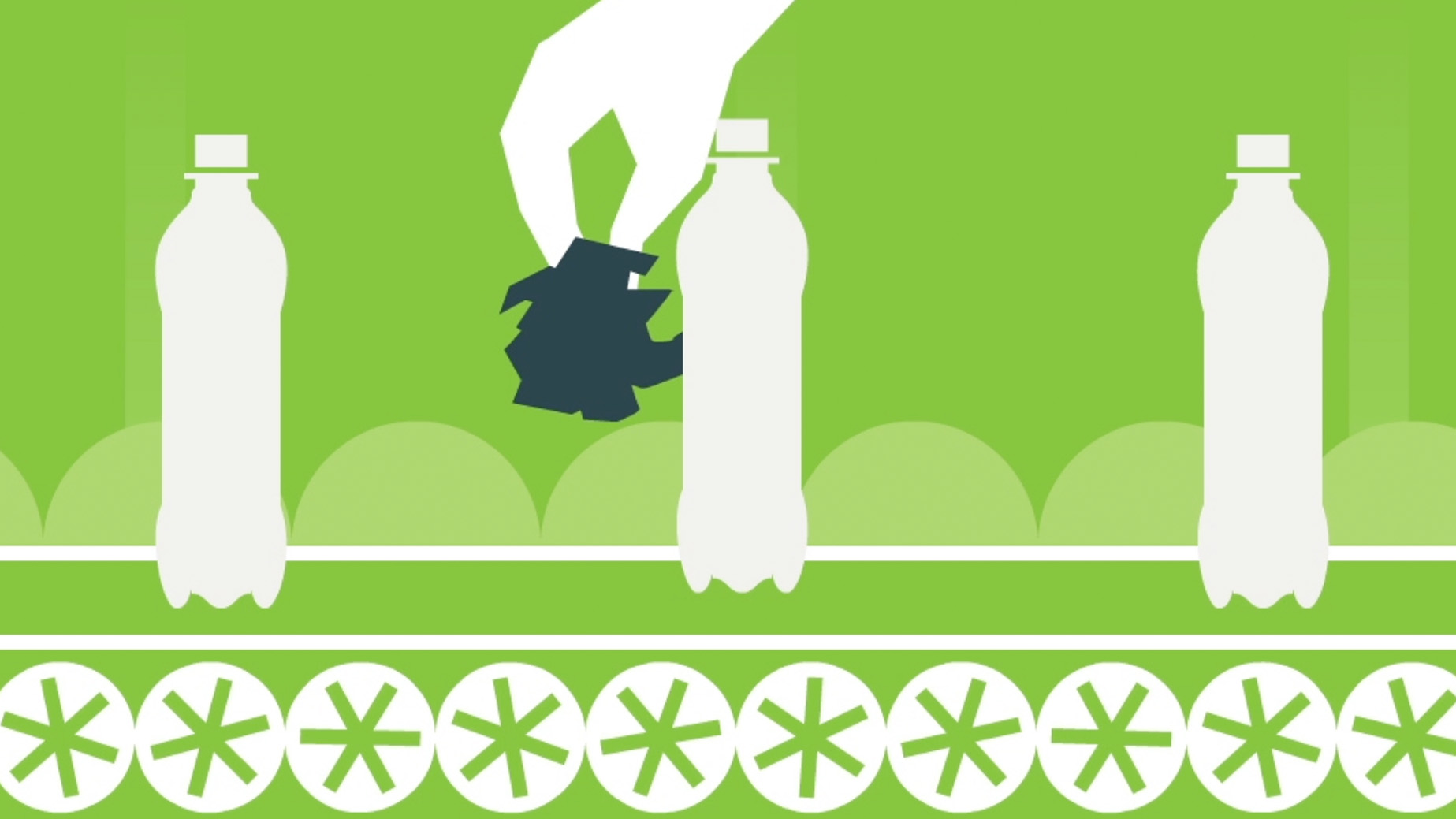
One of the most groundbreaking initiatives I led for ReCommunity was the development of an interactive virtual Materials Recovery Facility (MRF)—a first in the recycling industry.
The goal was to educate schoolchildren about the recycling process in an engaging and accessible way. We collaborated with world-renowned illustrator Peter Willems to create a highly detailed isometric illustration of the entire recycling process at an MRF. This complex visual served as the foundation for an interactive experience that allowed users—both online and at touchscreen kiosks in ReCommunity education centers—to explore the facility step by step.
Each station in the MRF was clickable, offering verbal descriptions and fun video clips tailored to elementary school children. The interactive experience transformed a traditionally technical and industrial process into an engaging, hands-on educational tool, helping younger generations understand the impact of recycling in their communities.
Educating the Next Generation
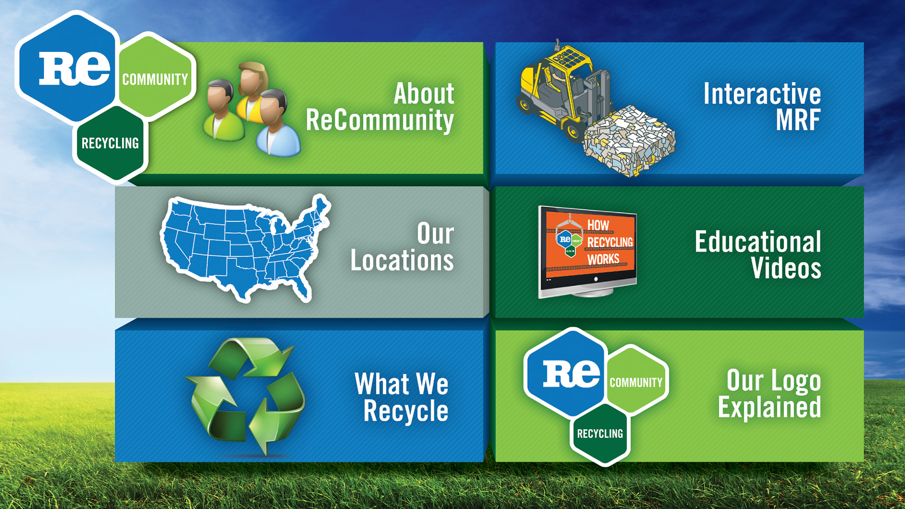
To further reinforce ReCommunity’s mission, I spearheaded the development of a comprehensive Education Resource Center. Knowing that the future of sustainability depends on younger generations, we created an interactive hub featuring:
- Lesson plans
- Animated videos
- Infographics
- Posters
- A first-of-its-kind Virtual Recycling Facility
This digital experience allowed students and educators to explore the recycling process firsthand, whether through in-person tours at ReCommunity’s Materials Recovery Facilities or through our immersive online platform.
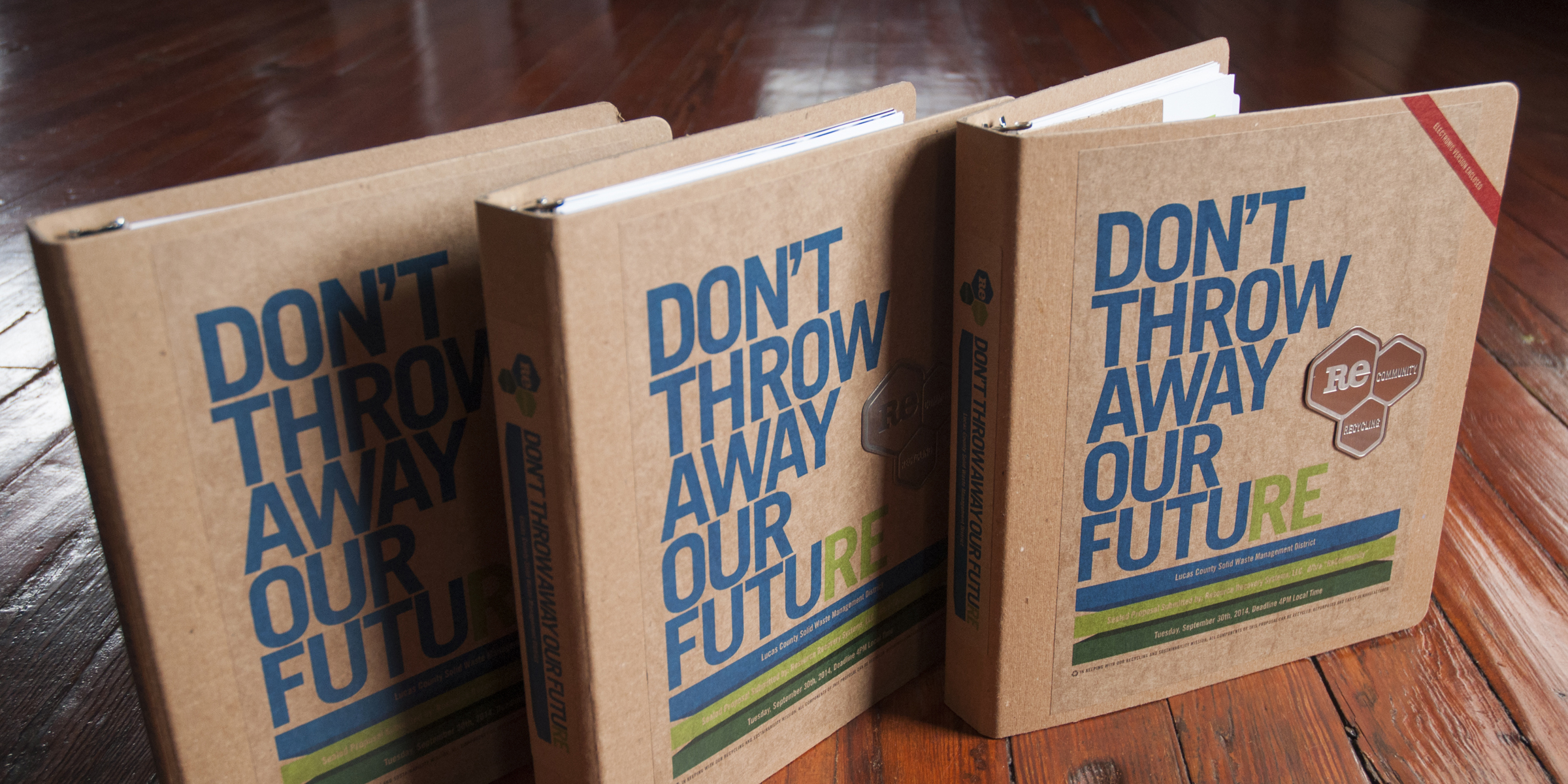
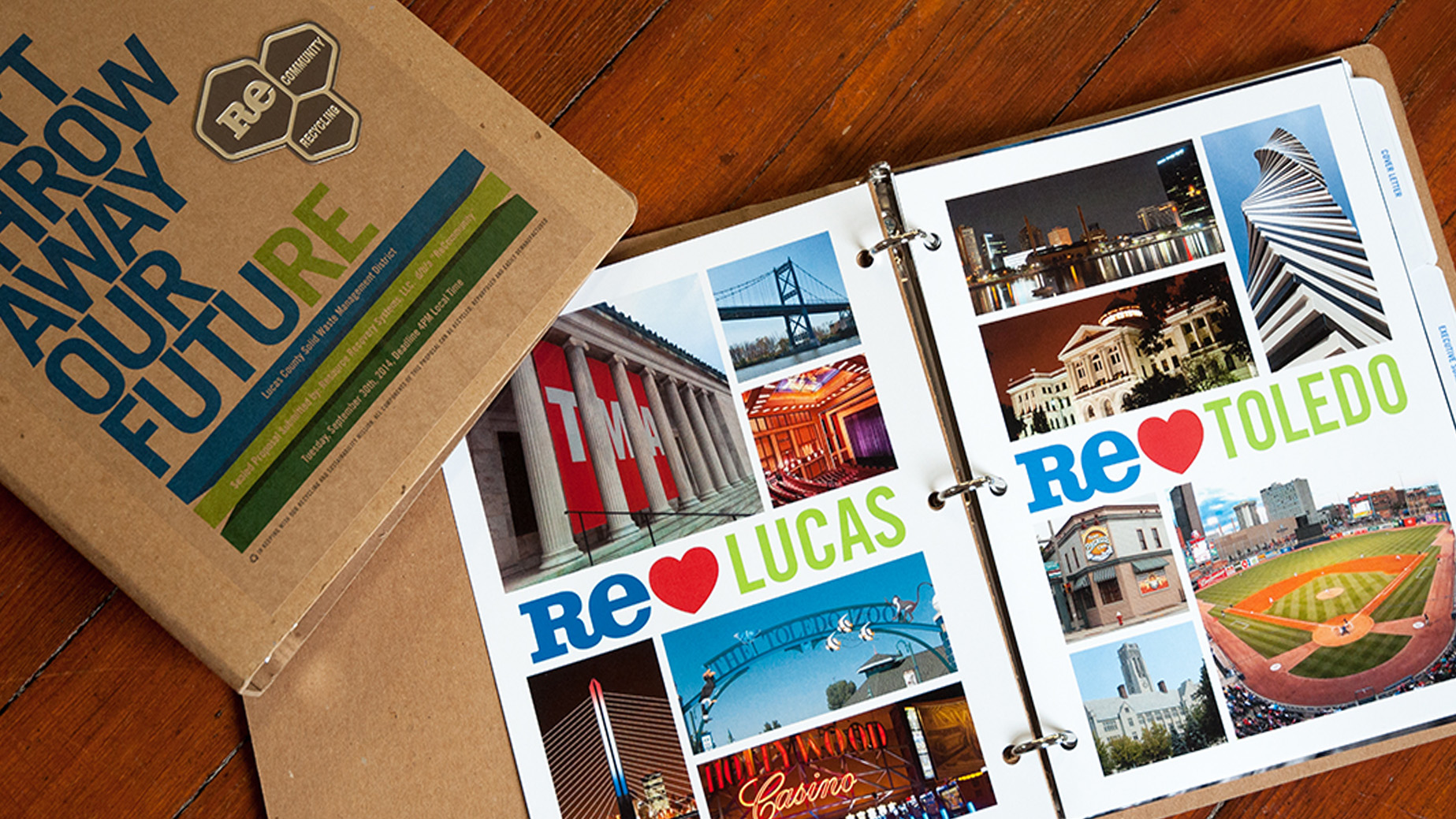
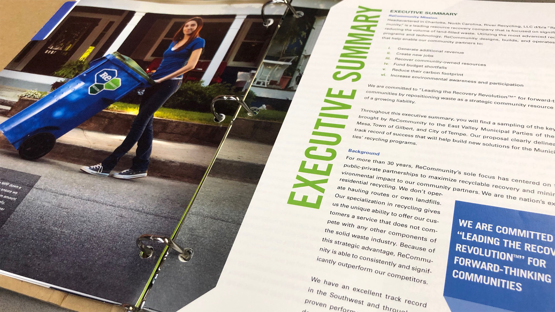
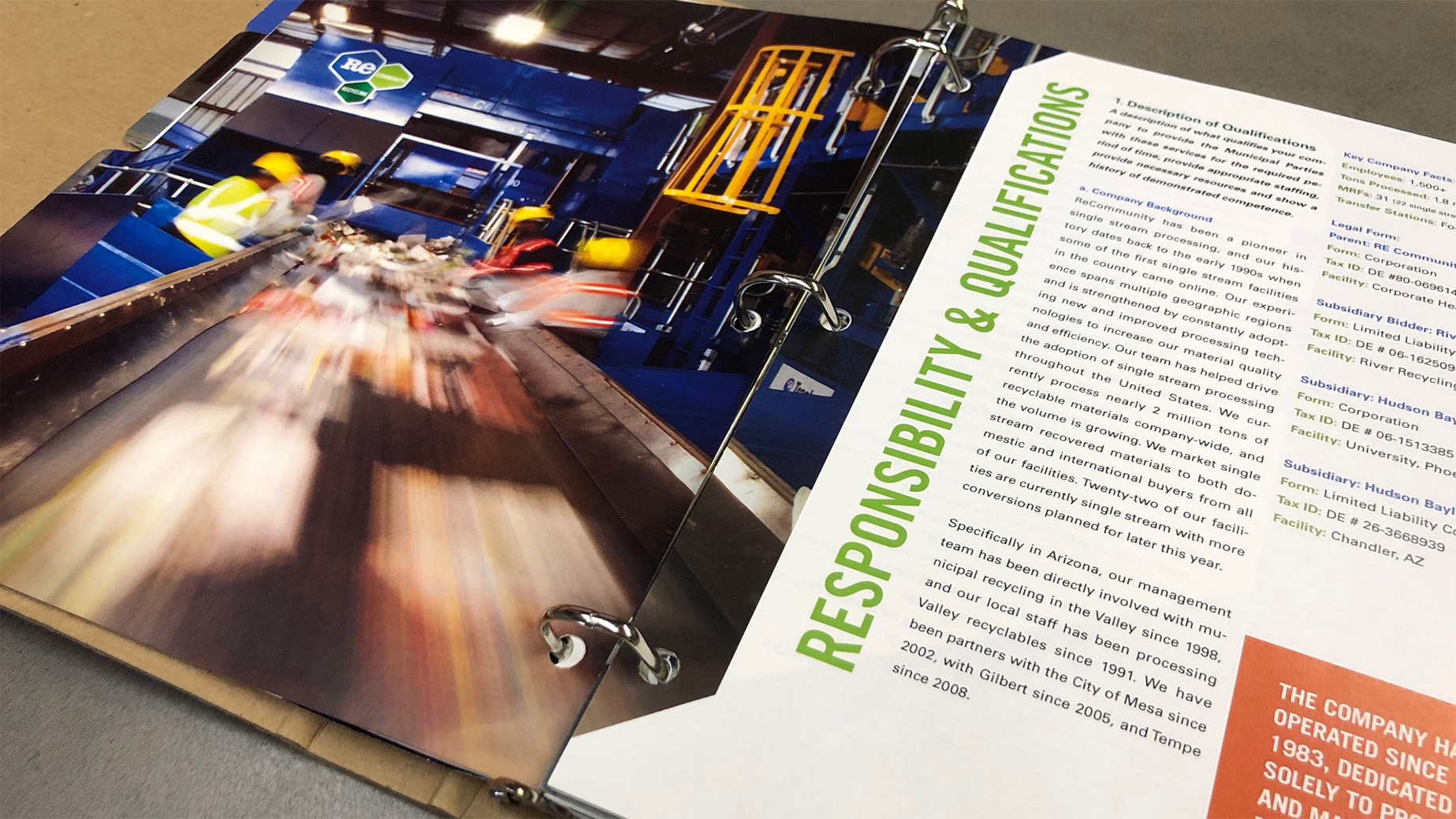
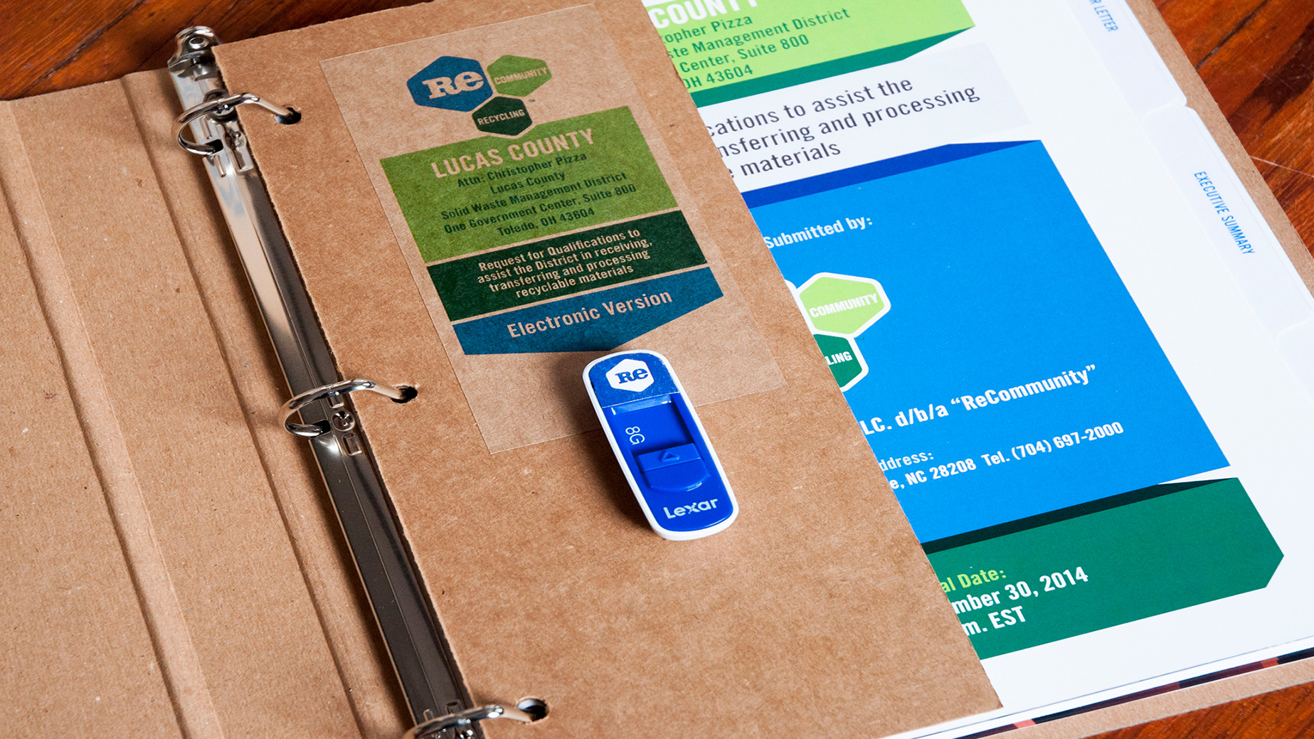
Winning RFPs Through Smart Design
For a company like ReCommunity, success hinged on the ability to win RFPs. I worked directly with their team to create a flexible, visually compelling RFP template that streamlined the proposal process while maintaining a strong brand presence. The format was fully customizable, allowing for variations in binding and presentation styles—from hardcover books to spiral-bound or three-ring binders. This design strategy became a game-changer, helping ReCommunity secure major projects and solidify their position as a leader in the recycling industry.
A Partnership Built on Innovation and Impact
From messaging and logo development to website strategy, education initiatives, and RFP solutions, my approach with ReCommunity was hands-on at every stage. I worked closely with their team to ensure every aspect of their brand not only looked great but served a strategic purpose in advancing their mission. Seeing our work come to life, helping communities embrace sustainability while positioning ReCommunity as an industry leader, was incredibly rewarding. This project wasn’t just about branding; it was about making a lasting impact.
Client
ReCommunity
Agency
Atomic Wash
Role
Creative Director
Art Director
Graphic Designer
Copywriter
Illustrator
Photographer
Creative Team
Christopher Sanna
Jamie Kasman
Greg Gatlin
Rebecca Sanna
Anita Finkelstein
John Reed
Asaph Outlaw
Jon Hoffman
Brahndi Asadi
Collaborating with Chris and Atomic Wash was a standout experience during my time at ReCommunity. Chris consistently went above and beyond to deliver exceptional results without compromise. Whether developing custom-tailored RFP responses, or filming a marketing video in Florida’s summer heat while standing knee-deep in recyclable materials, he remained focused, dedicated, and unwavering in his commitment to quality.
Stephen London
VP of Marketing