Overview
One of our earliest clients at Atomic Wash was Intersection Partners, a firm that developed and funded new business strategies in the healthcare and renewable energy industries. We had already completed a series of successful branding projects for their portfolio companies when co-founder Raphael Rakowski approached us with a new challenge—creating a logo for Intersection Partners itself.
At first, the process followed a traditional path. We went through multiple rounds of concepts, refining and iterating, but nothing quite resonated. Some designs felt too corporate, others too sterile. Despite our best efforts, we weren’t capturing the essence of the company.
Then came the breakthrough. During a pivotal conversation, it became clear that this project wasn’t about designing a conventional logo—it was about crafting something deeply meaningful to Raphael and his co-founder, Andy Lipman. It needed to embody their belief in the power of intersections: people and purpose, time and space, opportunity and vision. The solution wasn’t in pixels or vectors. I needed to step away from the computer and pick up a pencil. Authenticity.
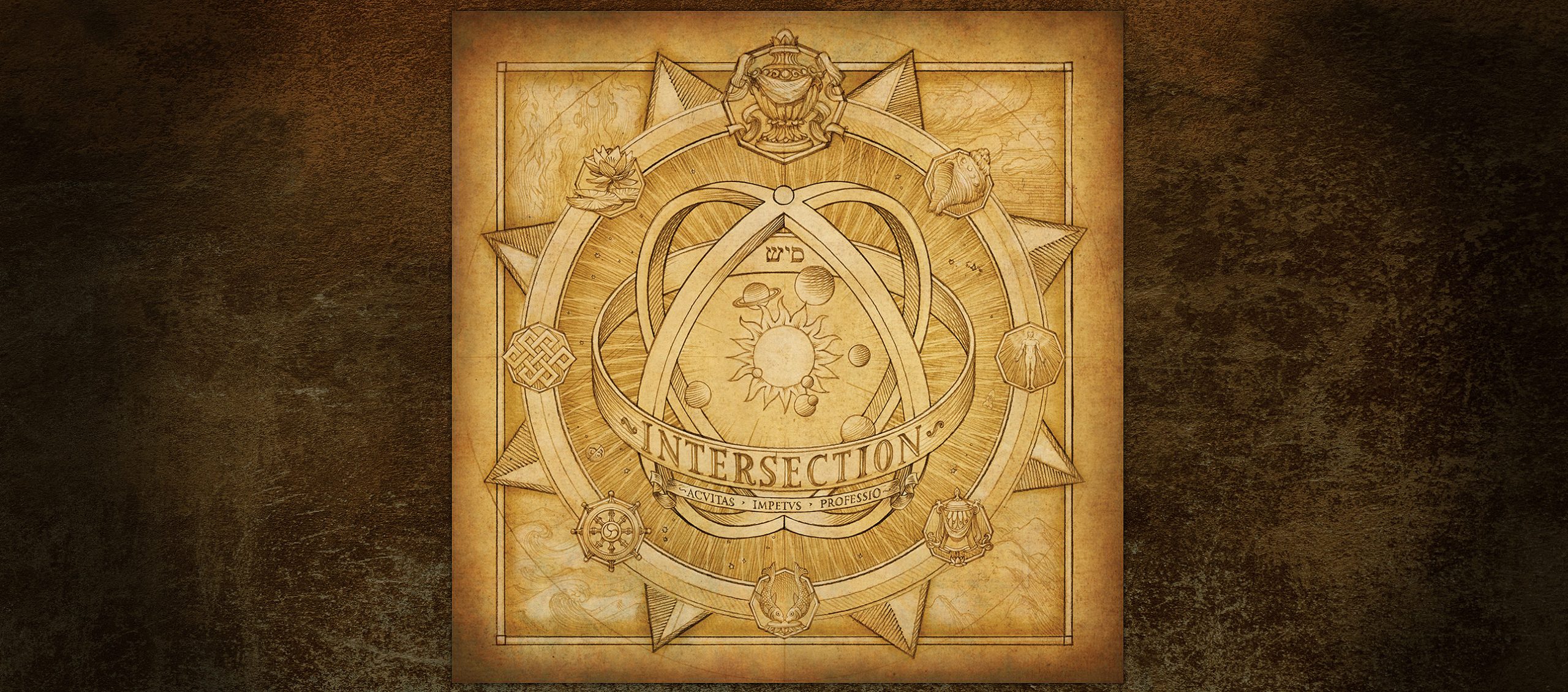
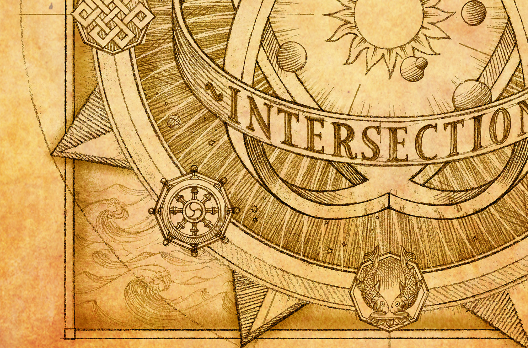
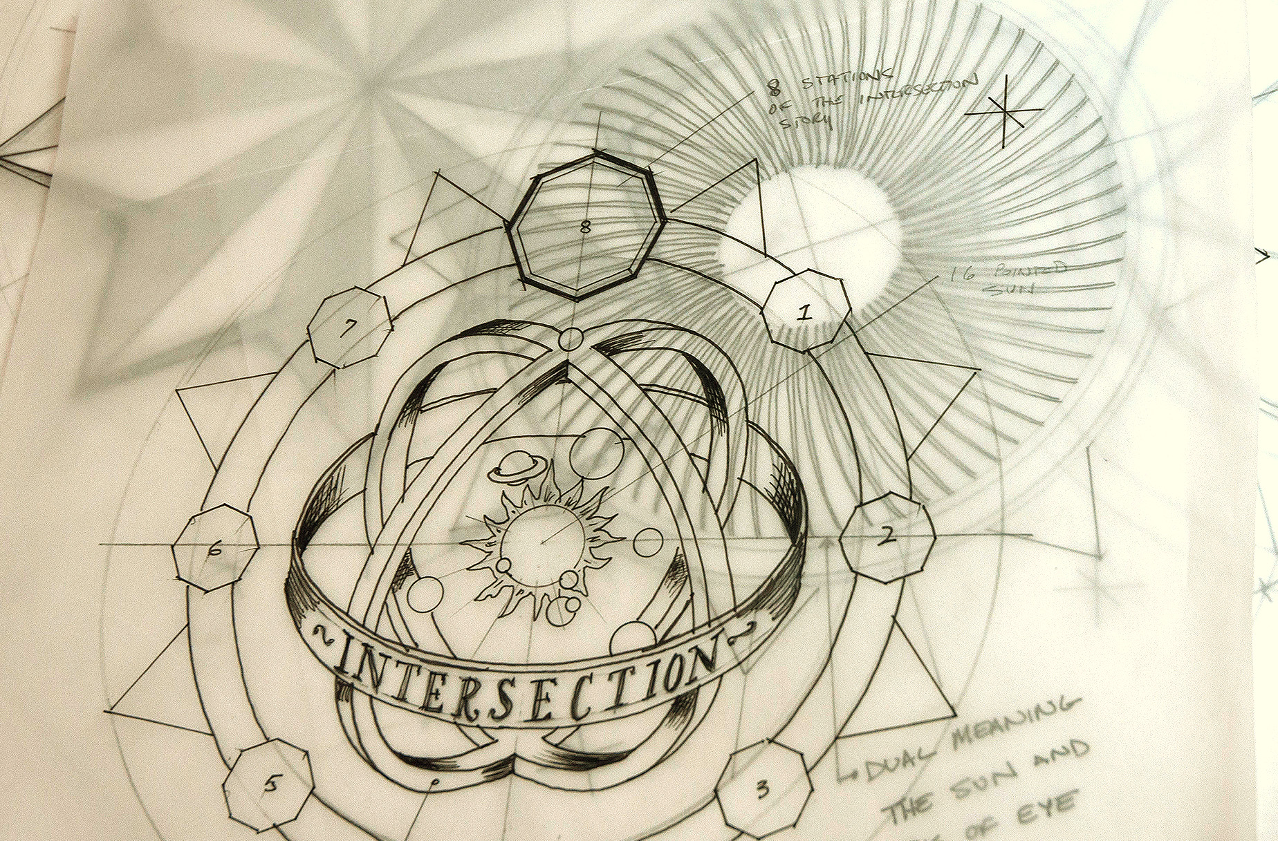
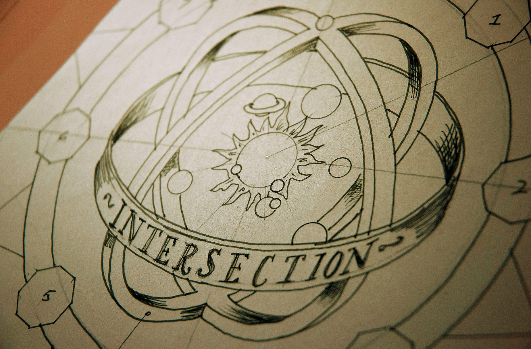
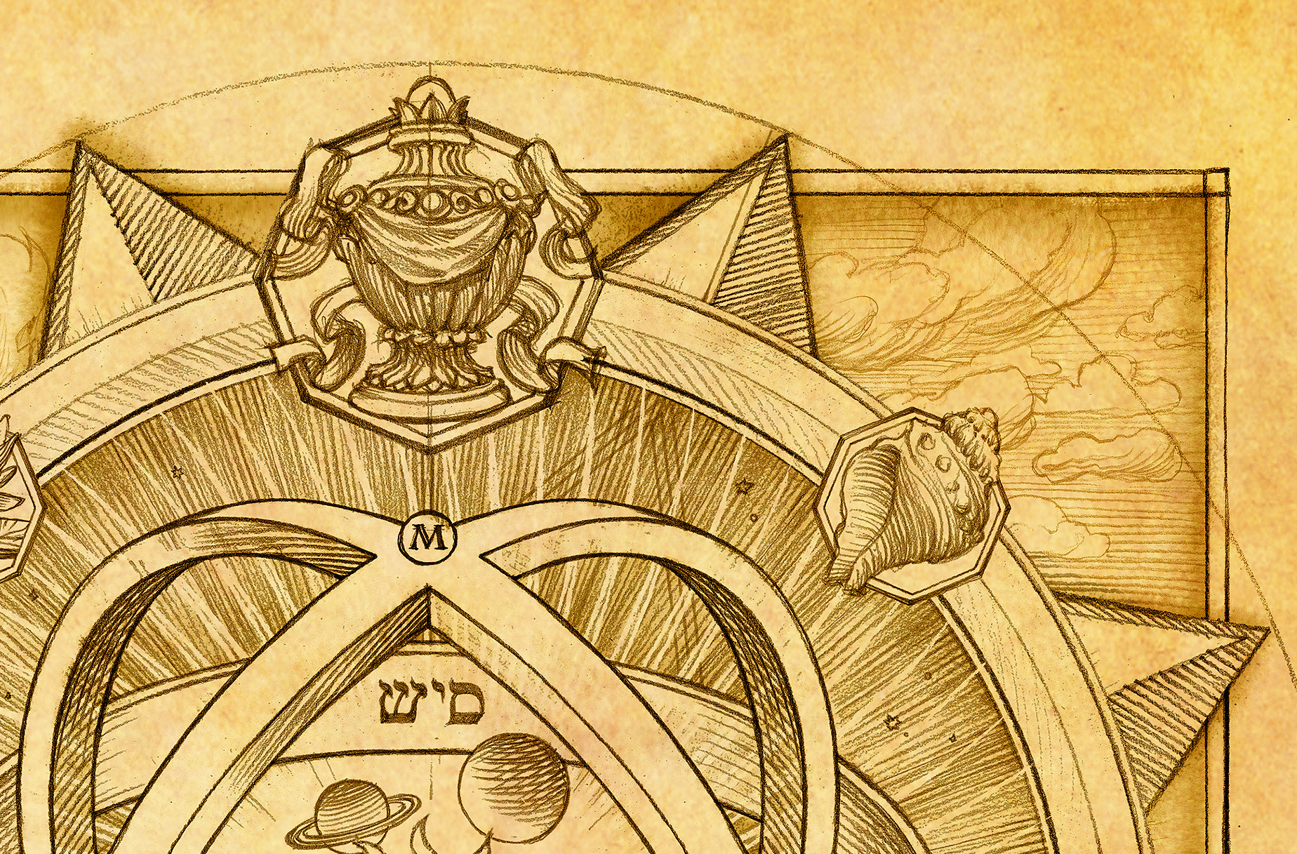
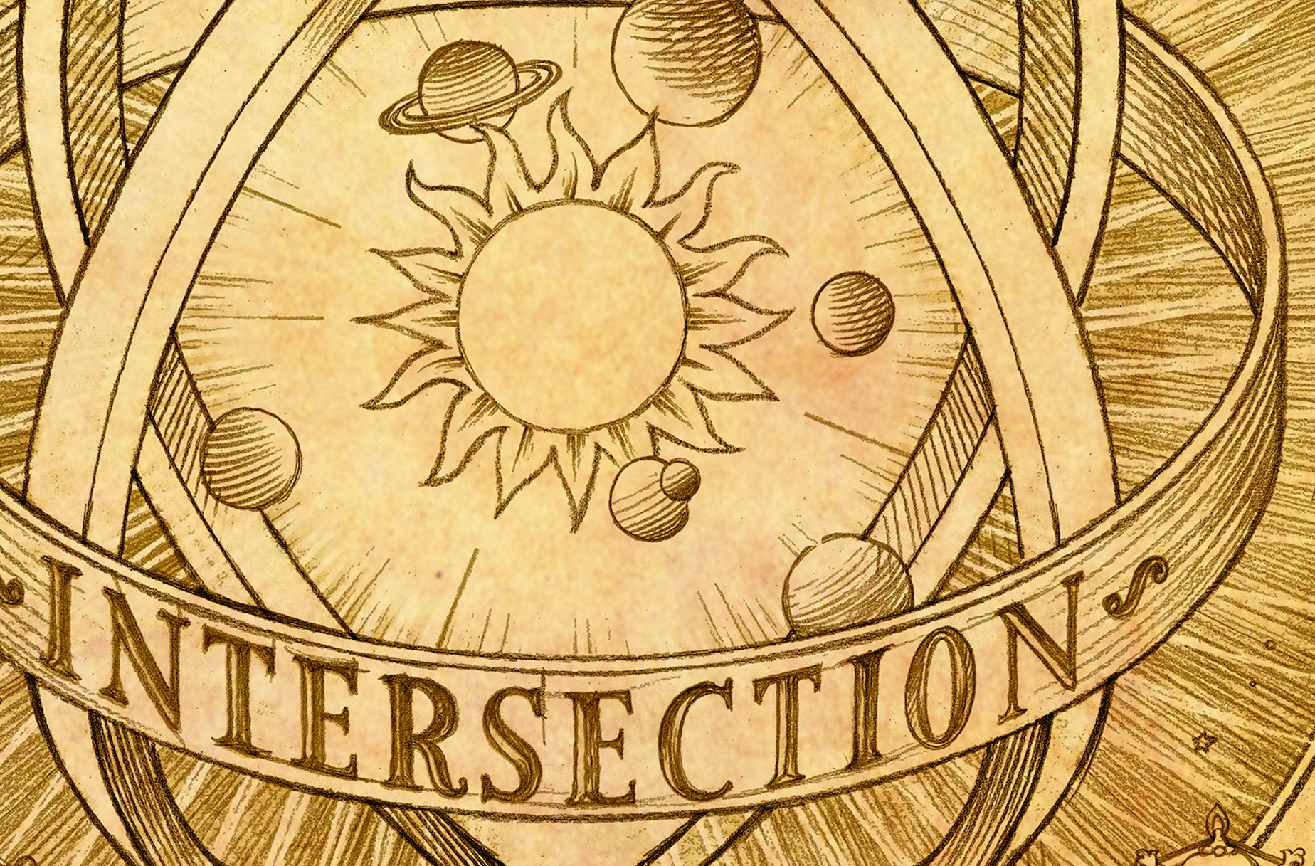
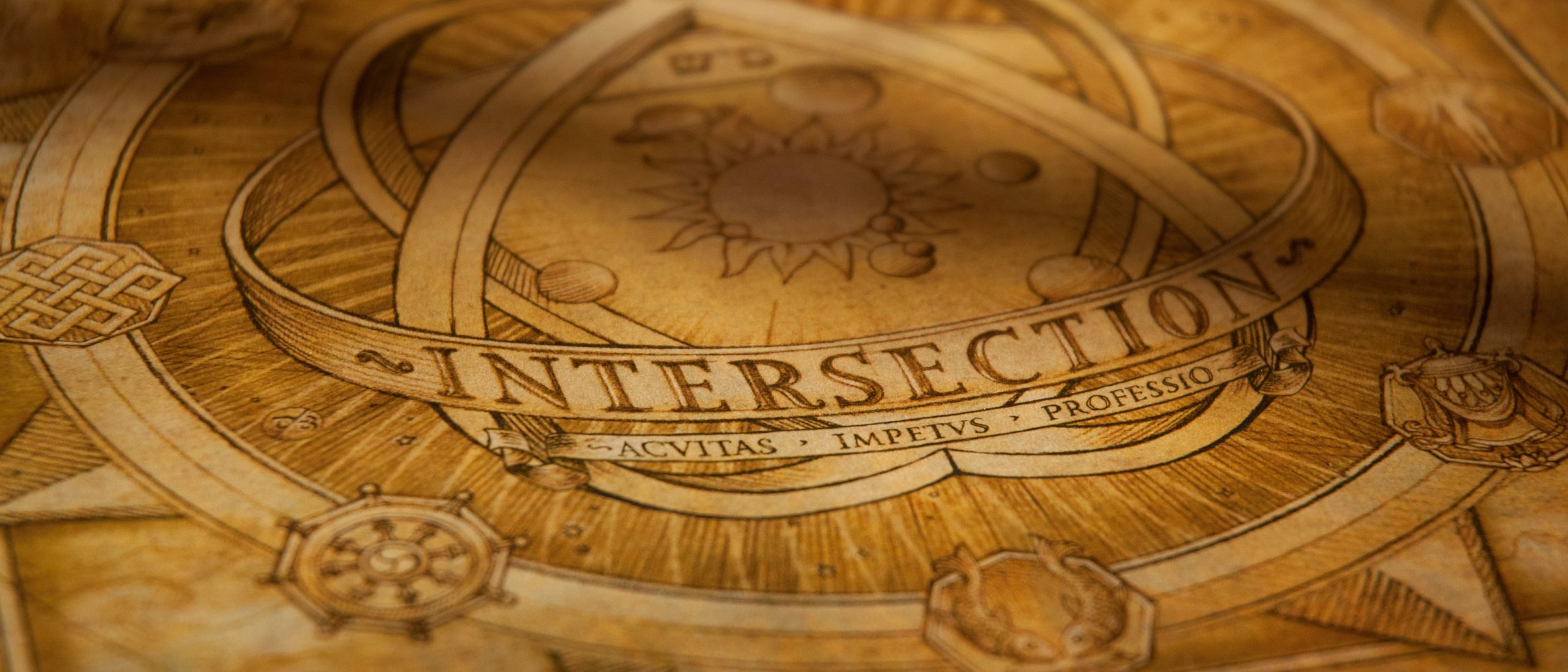
I dove into historical research, looking for inspiration in unexpected places. That’s when I landed on the astrolabe — an ancient instrument used for navigation, timekeeping, and astronomy. The connection was undeniable. Just as the astrolabe guided explorers and scholars in charting their course, Intersection Partners helped businesses find their way to success.
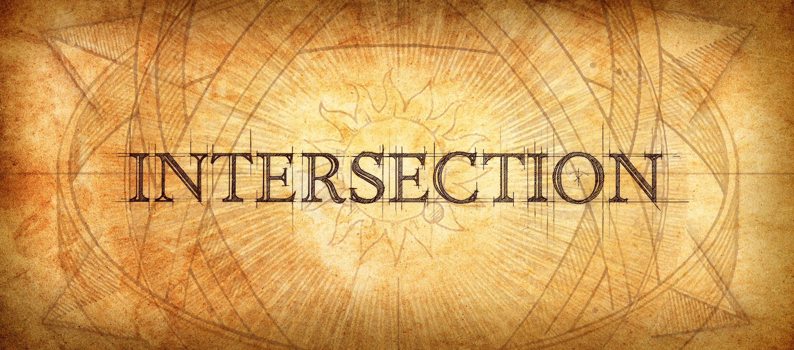
With this realization, I sketched a rough concept—an intricate illustration filled with symbols, hidden meanings, and nods to the company’s philosophy. It wasn’t just a logo; it was a “logostration”—a hybrid of logo and illustration, rich with detail and significance. When we presented it to Raphael and Andy, they instantly saw its meaning. It was exactly what they had been searching for.
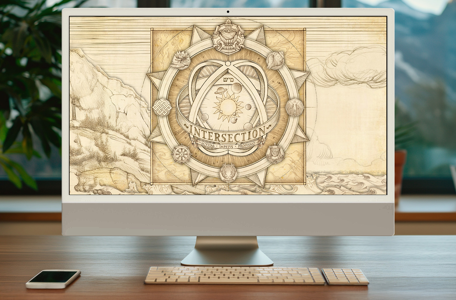
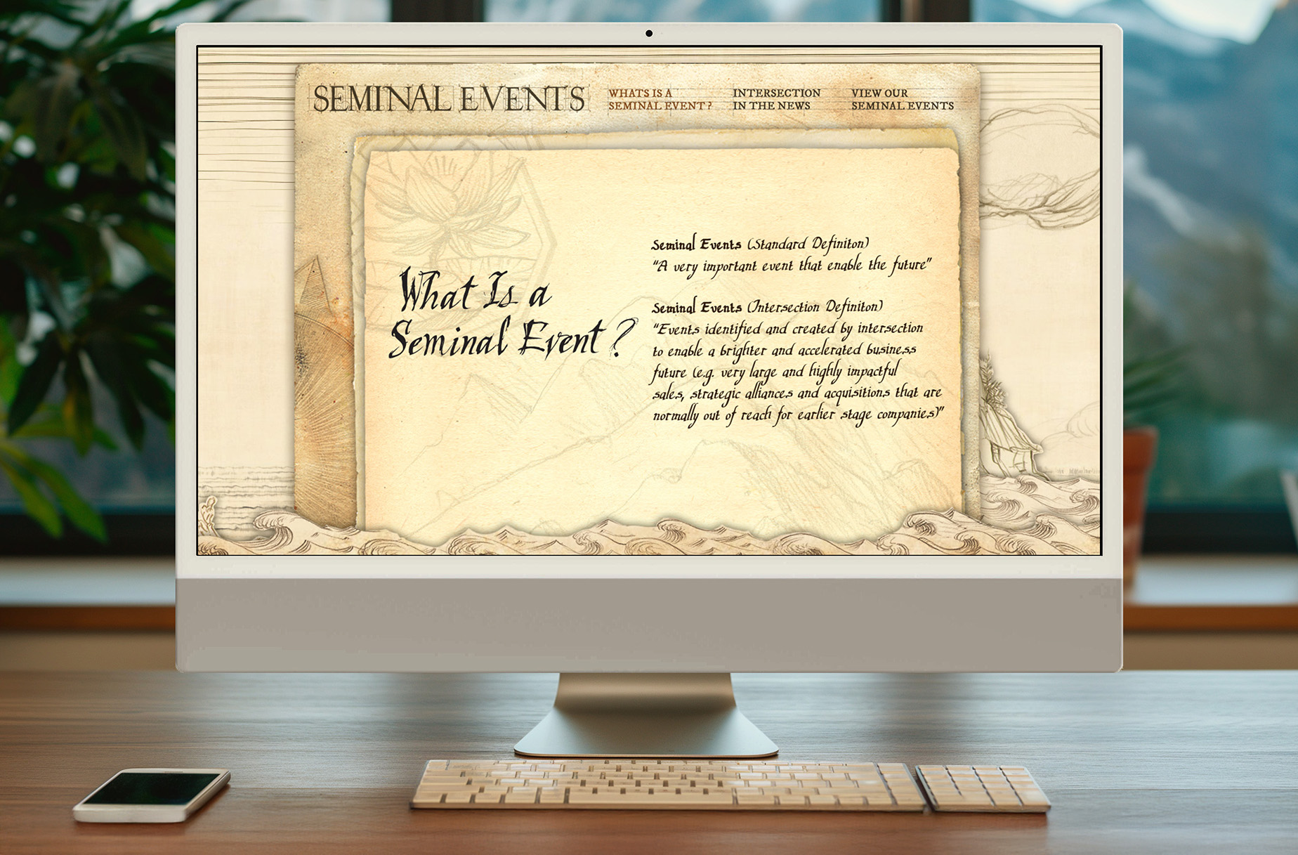
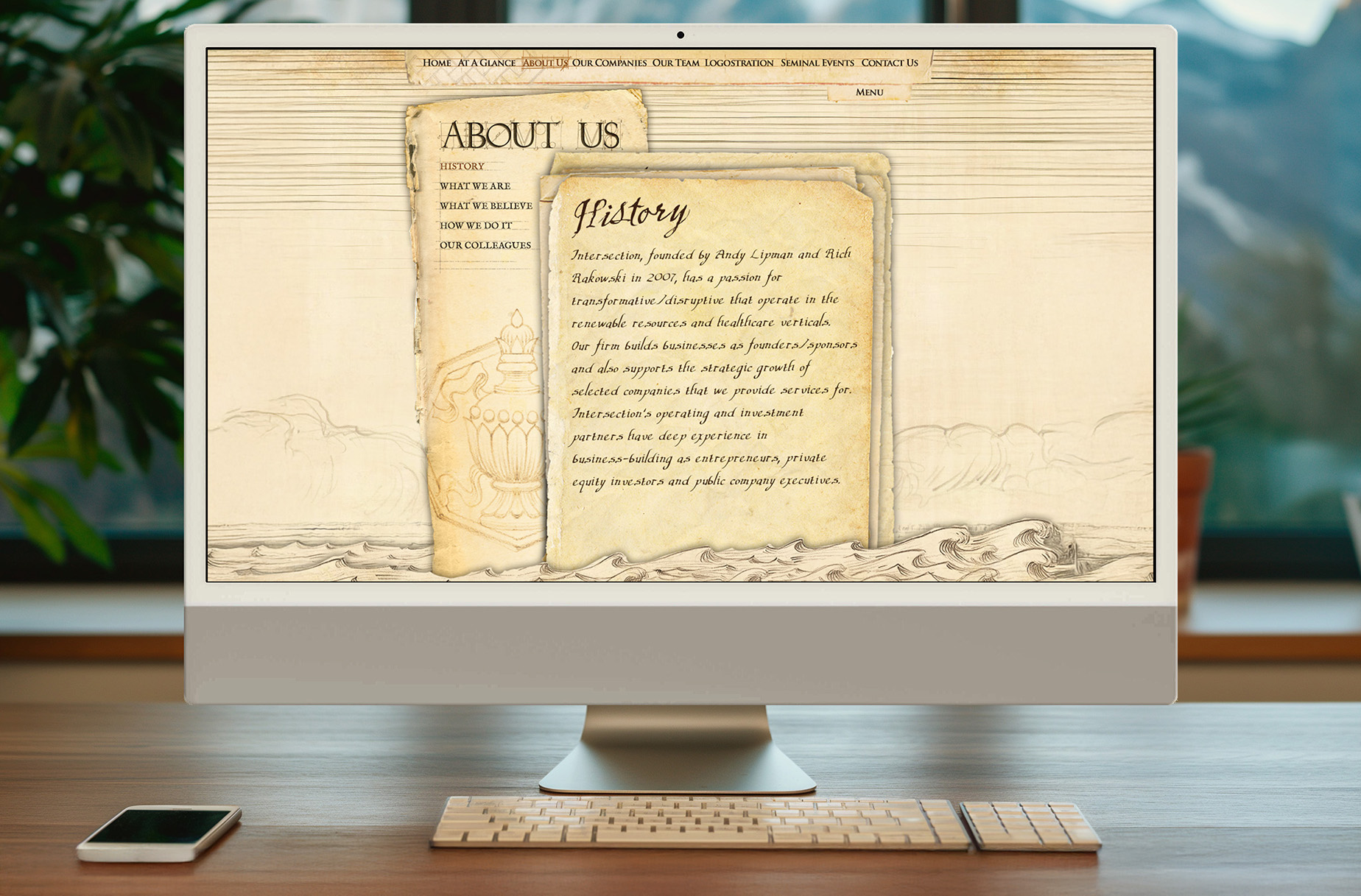
To bring the vision to life, I collaborated with a highly skilled illustrator to refine the artwork. The final design looked like it had been lifted straight from Da Vinci’s workshop—timeless, intricate, and full of depth. It became the cornerstone of Intersection Partners’ brand, extending into a fully hand-drawn website featuring parallax motion and animation.
This project was unlike anything we had done before—bold, unconventional, and deeply personal. But then again, so were the founders of Intersection Partners. Helping them bring their vision to life remains one of the most rewarding experiences of my career.
Client
Intersection Partners
Agency
Atomic Wash
Role
Creative Director
Graphic Designer
Illustrator
Creative Team
Christopher Sanna
Jamie Kasman
Greg Gatlin